Physical Address
304 North Cardinal St.
Dorchester Center, MA 02124
Physical Address
304 North Cardinal St.
Dorchester Center, MA 02124
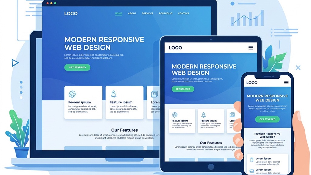
We start by looking at the grid system that drives the layout. A responsive joomla template relies on a fluid grid where columns are defined in percentages rather than fixed pixels. This allows the page to stretch or shrink as the viewport changes. When the grid is built on a 12‑column basis, each module can occupy any number of columns, and the template automatically re‑calculates the width for tablets, phones, and desktops. The result is a layout that feels natural on every device without the need for separate mobile files.
Media queries are the CSS rules that tell the browser how to adjust the design at specific viewport widths. In a responsive joomla template we typically see breakpoints at 320 px, 480 px, 768 px, 1024 px, and 1280 px. These points match the most common device sizes and let us hide, resize, or reposition elements. By keeping the breakpoints simple and consistent across the theme, we reduce the chance of layout glitches when new devices appear.
Images, videos, and iframes must also adapt. Modern Joomla templates use the srcset attribute and the picture element to serve the appropriate image size for each screen. For videos, we wrap them in a responsive container that maintains the aspect ratio. This approach prevents horizontal scrolling and keeps the page lightweight, which is essential for a responsive joomla website.
Google now crawls the mobile version of a site first, as described in Google’s mobile-first indexing documentation. If our Joomla site does not render correctly on a phone, the search engine may miss important content or rank the page lower. By adopting a mobile‑first approach, we ensure that the primary HTML, CSS, and JavaScript are optimized for the smallest screens, and then we enhance the layout for larger devices.
Recent studies show that more than 55 % of web traffic comes from mobile devices. Users expect fast loading times, easy navigation, and readable text without zooming. A mobile‑first joomla design meets these expectations and reduces bounce rates. When visitors have a smooth experience on their phones, they are more likely to stay, explore, and convert.
Many Joomla users rely on page builders such as SP Page Builder, Quix, or other tools from our Joomla page builders roundup. A good responsive joomla template offers native support, meaning the builder’s modules inherit the grid and breakpoints automatically. This saves us from writing custom CSS for each layout and keeps the design consistent across the site.
Speed is a core part of mobile friendliness and overall Joomla performance optimization. We should check that the template uses minified CSS/JS, lazy loads images, and offers options for async script loading. Templates that bundle assets efficiently help us achieve a high score on PageSpeed Insights and improve the overall user experience.
A responsive joomla theme must work in Chrome, Firefox, Safari, Edge, and even older browsers like Internet Explorer 11 (if the client still needs it). The template should include fallback styles and avoid CSS features that are not widely supported. We also look for a testing guide that shows how to verify the layout on popular devices.
Helix Ultimate is a popular framework that provides a solid grid system, built‑in off‑canvas navigation, and extensive customization options. It works well with Joomla 4 templates and supports a mobile‑first joomla design out of the box. The framework also includes a library of pre‑styled modules that adapt to any screen size.
The T4 framework focuses on flexibility and speed. It offers a visual layout builder, automatic CSS generation based on breakpoints, and integration with Joomla’s core features. T4’s approach to responsive design makes it easy for us to create a responsive joomla website without writing a lot of custom code.
Warp is known for its lightweight code and modular architecture. It provides a simple grid, responsive image handling, and a clean API for developers. Because it is minimalistic, we can add only the features we need. For those interested in building themes from scratch, our Joomla template development guide covers the full process, keeping the final page fast and mobile‑friendly.
The quickest way to verify responsiveness is to run the URL through the Google Mobile-Friendly Test. The tool highlights any elements that are too small, too close together, or cause horizontal scrolling. We can then adjust the CSS or layout accordingly.
All modern browsers include a device toolbar that lets us emulate phones, tablets, and custom screen sizes. In Chrome, we open DevTools (F12) → Toggle device toolbar (Ctrl + Shift + M). This view shows us how the template reacts to different resolutions and lets us test touch interactions directly.
Emulators are useful, but real devices reveal performance issues that a browser cannot simulate, such as network latency, touch‑screen quirks, and hardware‑specific rendering bugs. We recommend testing on at least one Android phone, one iPhone, and a tablet. If we have a device lab, we can automate the process with tools like BrowserStack or Sauce Labs.
Images are often the biggest source of page weight. We compress them using tools like TinyPNG or the Joomla extension linked in Joomla image optimization. Adding loading="lazy" to <img> tags ensures that images below the fold load only when needed, reducing initial load time.
Minification removes whitespace, comments, and unnecessary characters from style sheets and scripts. Many responsive joomla templates include a built‑in minifier, but we can also use extensions like JCH Optimize. By serving a single combined CSS file and a single combined JS file, we cut the number of HTTP requests and improve the score on PageSpeed Insights.
Caching tells the browser to store static assets for a set period, so repeat visitors do not download them again. We configure caching in Joomla’s global configuration and can extend it with the Joomla caching extension. Pairing caching with a Content Delivery Network (CDN) such as Cloudflare or the Joomla CDN setup distributes assets globally, delivering them from the nearest edge location.
A common error is to keep desktop‑style menus that require hover actions. On touch devices, hover does not exist, so we must provide larger tap targets, clear‑menus, or off‑canvas menus. Using a mobile‑friendly joomla template that includes a hamburger icon and expandable sub‑menus solves this problem.
Joomla’s modular architecture is powerful, but adding too many modules to a single page can break the fluid grid. When modules overflow the column width, they cause horizontal scrolling. We should keep the number of modules reasonable and use the template’s built‑in module positions that are designed to collapse gracefully on small screens.
Core Web Vitals—Largest Contentful Paint (LCP), First Input Delay (FID), and Cumulative Layout Shift (CLS)—are key ranking factors. A responsive design that loads large images or heavy scripts can hurt these metrics. By optimizing images, minimizing JavaScript, and avoiding layout‑shifting elements, we keep the site healthy in the eyes of both users and search engines.
When we choose a responsive joomla template, we are not just picking a visual style; we are adopting a set of practices that keep the site fast, accessible, and future‑proof. By focusing on fluid grids, media queries, and responsive media, we create a solid foundation. Adding mobile‑first joomla design principles ensures that the site meets Google’s indexing requirements and the expectations of today’s mobile users.
Our next step is to evaluate the top frameworks—Helix Ultimate, T4, and Warp—against the feature checklist: page‑builder compatibility, performance options, and testing support. Once we have selected a template, we follow a systematic testing routine: run the Google Mobile‑Friendly Test, use DevTools to emulate devices, and finally verify on actual phones and tablets.
Optimization does not stop at layout. We compress images, enable lazy loading, minify assets, and set up caching and a CDN. These actions directly improve Core Web Vitals and help the site rank higher in search results.
Finally, we stay aware of common pitfalls such as touch‑unfriendly navigation, module overload, and neglecting performance metrics. By addressing these issues early, we deliver a responsive joomla website that feels smooth on any device.
If you need a starting point, explore our collection of best Joomla templates or try a free Joomla template to see how the concepts work in practice. If you run a content site, our Joomla blog templates guide highlights designs built specifically for publishers. For deeper customization, check out our guide on customize a Joomla template and the step‑by‑step instructions on install a Joomla template.
By following this mobile‑first design guide, we can build Joomla sites that are not only visually appealing but also fast, searchable, and ready for the devices of tomorrow.