JoomlaXTC Template Parameter Instructions:
JoomlaXTC XTC Framework template system provides complete control over the template styles, from Width Adjustments, Region and Column Layout, Backgrounds, Font Colors / Sizes / Typeset, Module Layout, Menus and much more.
Using the standard Joomla! programming interface, the XTC Framework provides simple yet powerful template creation tools that allows developers to rapidly build or change every aspect of template elements and its administration panel and provide final users with easy and familiar controls to configure the template.
The Parameters are split into 6 areas: Global, Default, Grid, Style, Typography, and Advanced. We will now explain how these parameters work:
Global Parameter Instructions:

The Global Parameters define the display mode operations for default or mobile based layouts. The default layout should be selected to render the site in web mode. To test the mobile layout online, simply change the default setting to mobile and the site will load the mobile version of the template.
The mobile device detection is a browser sniff to check if the browser is web or mobile based and will display the mobile layout when activated.
Layout Parameter Instructions:

The Layout Parameters define the layout mode operations for default or mobile based layouts. This is where you can select the GRID format to use as well as you default style to load for Web and Mobile based browsers.
Grid Parameter Instructions:
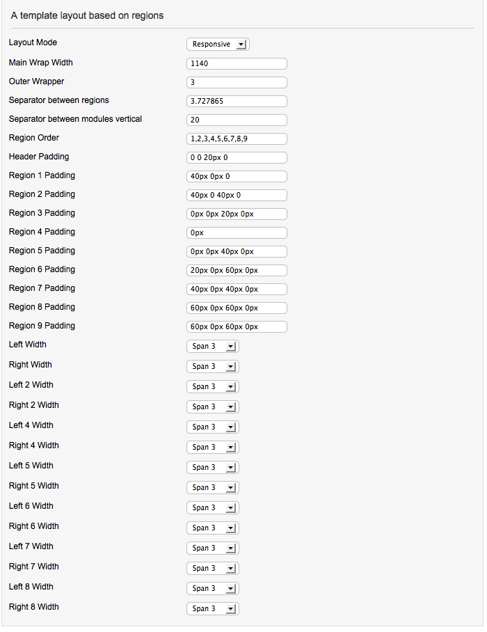
The Grid Parameters define the layout grid style for the layouts. This is where you can select the GRID format to use as well as set Column and Region order, Widths and Rows.
The default Bootstrap grid system utilizes 12 columns, where as we use their fluid grid system that uses percents instead of pixels. The left and right's columns width are using the twitter boostrap grid system for the columns width.
By select span4 for left column and span4 for right column. Then center column where component is will have span4 class also. Each of the columns will have equal width.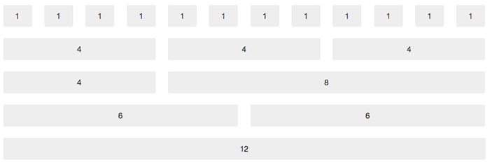
A quick round up of the span classes:
- span1 = 1/12 of total width.
- span2 = 2/12 of total width.
- span3 = 3/12 of total width.
- span4 = 4/12 of total width.
- span5 = 5/12 of total width.
- span6 = 6/12 of total width.
- span7 = 7/12 of total width.
- span8 = 8/12 of total width.
- span9 = 9/12 of total width.
- span10 = 10/12 of total width.
- span11 = 11/12 of total width.
- span12 = 12/12 of total width.
Style Parameter Instructions:
The Style Parameters define the templates color and image styles for the layout. Each style has it's own set of parameters to modify the look of the site without touching one line of code! The Style Parameters are split onto 7 basic areas: Body, Style Base Color Scheme, Header, Menu, Regions, Module, Typography. We will now explain how these parameters work:
Body Parameter Instructions:

The Body Parameters refer to the Website overall background. You can select a background color for the site as well as select a custom background image with image positioning such as : repeat-x, repeat-y, top center no-repeat, etc.
Color Scheme Parameter Instructions:
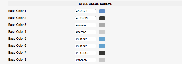
The Base Color Parameters were introduced to give you quick overall site color schemes. In the current template the base colors are set as follows:
The Base Color Parameters were introduced to give you quick overall site color schemes. As an example: In style 1 we have the Base Color 1 set to a blue color vaule of #5e8bc9. If you look at the fron end of the website you will notice that every almost every blue color from text to button styles can be changed from this one simple vaule! In the current template we are using Base Colors 1, 2, and 3. The remaing base colors can be assigned to anything you like!
Header Parameter Instructions:
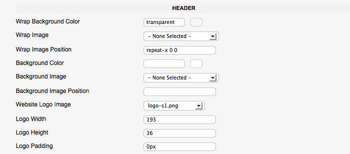
The Header Parameters refer to the top portion of the website where the Logo, Top, and Main Menu reside. The Header Wrap is the Full width wrap background for the top area. You can select a color value and / or a background image. The Background Color and Image Parameters are for the Inner wrap that is set in your overall site width in the GRID Parameters. The Website Logo is also set here. In order to change the Logo, you must first upload a new logo images to the template images folder in templates/responsive/images/logos. After uploading a new image you can select that image from the dropdown and set the Width, Height, and Padding vaules.
Menu Parameter Instructions:

The Menu Parameters refer to the Main Menu styling inside the Header area:
- The Background Color Parameter defines the overall Background color for the Menu Wrap.
- The Item Background Color defines each Menu Item background color.
- The Item Hover Color defines each Menu Item Hover State background color.
- The Item Active Color defines each Menu Item Active State background color.
- Color defines each Menu Item font color.
- Hover Color defines each Menu Item Hover State font color.
- Active Color defines each Menu Item Active State font color.

The Drop Down Parameters refer to the Main Menu Drop Down styling for the Main Menu:
- The Background Color Parameter defines the overall Background color for the Drop Down Menu Wrap.
- The Item Background Color defines each Menu Item background color.
- The Item Hover Color defines each Menu Item Hover State background color.
- The Item Active Color defines each Menu Item Active State background color.
- Color defines each Menu Item font color.
- Hover Color defines each Menu Item Hover State font color.
- Active Color defines each Menu Item Active State font color.
Regions Parameter Instructions:
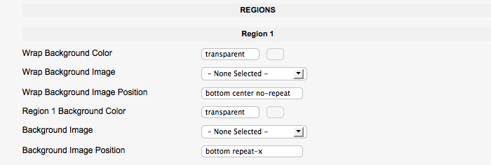
The JoomlaXTC Template Framework uses Regions for the Module Position and Grid Layout. You can use Custom Background Colors and Images for each region as well as re arrange the Region Order in the GRID Parameters. Each Region has the following parameters:
- Wrap Background Color Parameter defines the Full width Background color for Region
- Wrap Background Color Parameter defines the Full width Background color for Region
- The Item Background Color defines each Menu Item background color.
- The Item Hover Color defines each Menu Item Hover State background color.
- The Item Active Color defines each Menu Item Active State background color.
- Color defines each Menu Item font color.
- Hover Color defines each Menu Item Hover State font color.
- Active Color defines each Menu Item Active State font color.
Module Parameter Instructions:

The Module Parameters give you control over the DEFAULT module style. The Parameters are as follows:
- The Background Color Parameter defines the Background color for the Module
- The Title Background Color Parameter defines the Background color for Module Title
- The Title Icon is an optional Icon that goes to the left of the Module Title
- The First Word Color defines the First Word font color of the Module Title
- The Rest Word Color defines the Rest of the Words font color of the Module Title
Typo Style Parameter Instructions:
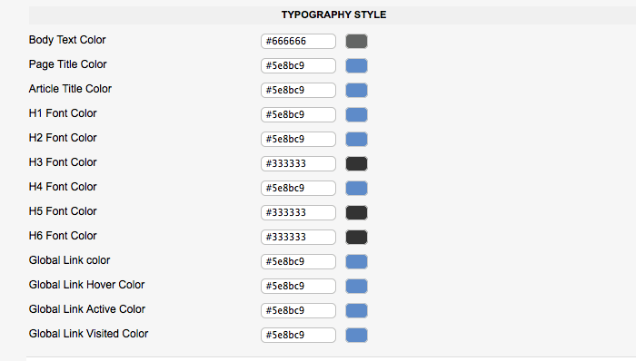
The Typography Style Parameter controls the base font colors for your site. You can select custom colors for everything from Global Font Color, H Colors, H2, Page Title, Article Title, Link, Hover and Active States.
Typography Parameter Instructions:

The Typography Setting Parameters define the font-size for the the template items such as Menu, H Styles, etc.
Advanced Parameter Instructions:

The Advanced Parameters handle the CSS file loading mode, CSS Compression, and the Component Frontpage Override. You can hide or display any Component from the frontpage simply by selecting which Components to render on the frontpage.
Additional Info
Responsive comes with 60+ Module Suffix Styles. The suffix styles can be viewed in our online demo - View
Responsive comes with many options for Typography Styles. The typo styles can be viewed in our online demo - View
Troubleshooting
There are some known limitations when using a Bootstrapped Responsive site. Please note the following:
When you setup your Joomla content pages menu items, then under the Layout Options parameters you have Intro Articles and Columns. Make sure Intro Articles # sums up with the # of Columns set:
Intro Articles: 4
Columns: 2
2 articles in two columns in 2 rows.
Or:
Intro Articles: 12
Columns: 4
4 articles in 4 columns in 3 rows
One important thing, in this template we have 6 modules in a row but due to limitations in the Bootstrap Grid,you will face layout issues IF you have 5 modules published in a row.
For more info on the XTC Framework please visit our Framework Docs -> GO!

