Main Menu Setup
For the Wedding Template we use the main menu on sub pages and the canvas menu for the home page.

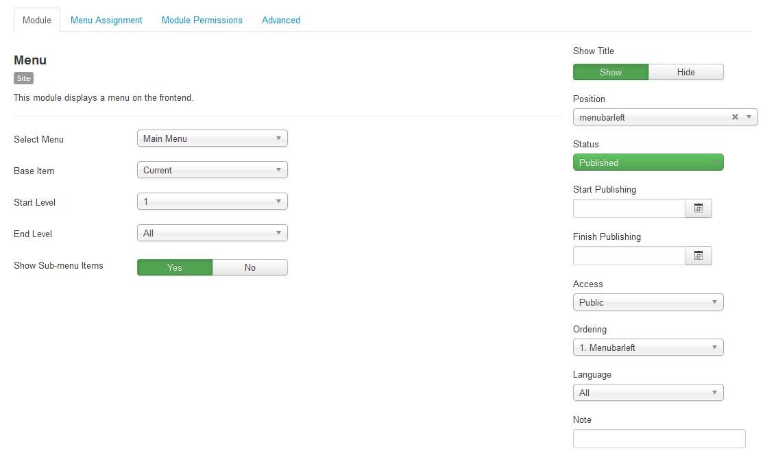
For the main menu we use the core Joomla! menu module. First you will need to open your Joomla Module Manager from Extensions / Module Magager menu in the backend administration side of Joomla.
Main Menu Module Assignment
Create a new Menu Module and assign the module to the menubarleft module position and select the mainmenu.

Main Menu Menu Parameters
Select the Menu Tab and make sure that the menu is displayed on all pages.

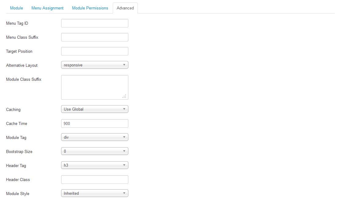
Main Menu Advanced Parameters
In order to use the the responsive features of the menu, you must select the advanced features tab and under alternative layout select the 'Responsive' layout.

Editing the Main Menu style
The Main Menu works with the three different menu classes built into our framework (suckerfish, dualfish and none).
- Suckerfish - Single Column Drop Down
- Dualfish - Dual Column Drop Down
- None - Optional for use with a 3rd Party Menu Module

To select the Menu Class first open the Template Manager and select the template. Next, select the Grid Parameters and scroll down to the Menu parameters.
- Menu Style: Suckerfish, Dualfish, or None
- Drop Down Position: Position for the Drop Down in pixels from the top of the site.
- Mobile Menu Width: The width in pixel you want the menu menu to switch to the mobile menu
Editing the Main Menu Javascript files
To change the MooTools effects of the Menu you must edit the code in the xtcMenu.js found the in the templates js/ folder. We have made this simple for you by including the basic JS code in the templates Layout folder. To edit: Open the templatename/layouts/default/layout.php file and edit the following:
xtcMenu(null, 'menu', 250,150,'h', new Fx.Transition(Fx.Transitions.Quint.easeInOut), 80, false, false);
The following is a quick reference guide to the Javascript Settings:
xtcMenu(container, menu-class, fx-duration, pause, fx-type, transition-type, fps, center, align);
- container: The menu container element or ID as string. When null passed, the container by default is the whole document body.
- menu-class: The class of the menus to be apply the script on.
- fx-duration: The duration of the menu animation (slide, fade or slide&fade) in miliseconds.
- pause: The amount of time in miliseconds the dropdown will wait before it starts to hide.
- fx-type: The effect type: 'h' for height, 'f' for fade, and 'hf' for both height and fade at the same time.
- transition-type: a Mootools transition object. Defautls to: new Fx.Transition(Fx.Transitions.Quint.easeInOut). (More at: http://mootools.net/docs/core/Fx/Fx.Transitions)
- fps: Frames per second for the animation. Recommended value is from 50 to 80. (It is NOT recommendable to increase the fps in order to achieve a better performance, if the browser and the DOM is too overloaded increasing the fps will actually add more load and the result may be worse. Fx smoothness is also determined by the browser video processing, always check how Chrome and IE are doing with the effect, Firefox is actually the worse at this.)
- center: When set to true, it will center the dropdowns under it's top level parent.
- align: When set to true it will prevent the dropdowns to go out from its wrapper.
Menu Icons
The menu icons in the dropdown menu are font awesome icons. You can add the icon name in the Link CSS Style in the menu item parameters under the Link Type tab. For a full list of the avaialable icons check the Typography page.

