JoomlaXTC Easy Image Gallery
Easy Image Gallery handles both the management of your website images as well as provide a common resource for any variety of frontend Image galleries. Designed for ease of use and system compatibility, the Easy Gallery offers many features such as:- Folder-based with unlimited folders and images within folders support
- Add, Rename, Move or Delete image folders without leaving the component
- Supports image uploads
- ZIP support for image uploads
- Two image browse views: Thumbnails and details
- Fast and intelligent image thumbnails and resizing with aliased quality
- Thumbnail caching on front and backend
- Thumbnail view uses drag&drop; to set image sort order
- 3 different and customizable thumbnail sizes for easier browsing
- Multiple actions for images: Delete, Rename, Move and more
- AJAX-based for quicker response
- Enable or disable images without deleting original files
- Assign custom Title, Description and link URLs to each image
- At-glance image information such as MIME type, dimensions, file size and original image review
- Completely configurable slideshow display with size, timers, transitions and more parameters
- Next, Prev, Pause and Play configurable buttons
- Configurable buttons for slideshow thumbnails
- Configurable text captions
- CSS-based styling with 13 pre-made Skins
- 108 configurable Transitions
- Lightbox support for images, Quicktime, Youtube and Vimeo videos
- iPhone/Smart phone compatible
- Cross-browser compatible
- Animated image preloaders
Installation
Installation is done as with any standard Joomla extension following these steps:- Download all files to your PC
- Use the standard Joomla Extension Manager to install the files.
Using the backend Image browser
The Easy Image Gallery browser can replace Joomla's own media manager to handle all your image management needs and more. You can access the browser in the administrator backend by choosing any option in the Components / Easy Image Gallery menu option. The browser displays a hierarchy of all the directories from your website images/ folder on the left side and the contents of a selected folder on the right.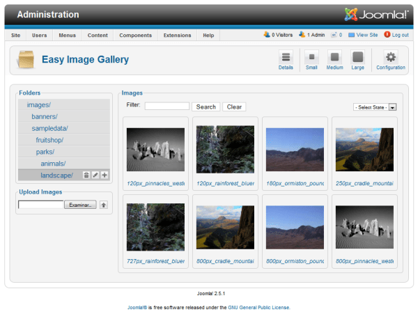
Folders
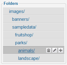 The Folders panel enables you to navigate all available folders with just one click. To see a folder contents, click on its name and the contents will appear on the panel to the right. Also, several action icons can appear for a folder. Click on them to perform these tasks on the folder:
 | Delete the folder and all its contents. |
 | Rename or relocate a folder and its contents. |
 | Add a directory within the selected folder. |
After clicking on an icon, a pop-up window will be shown where you can confirm or enter the details of the action.
On the right side, the contents of the selected folder are shown as thumbnails or as a detail list, you can select the display mode at any time with the following tool bar icons on the top right:
 | Thumbnail view. |
 | Detail view (Joomla classic format) |
Thumbnail View
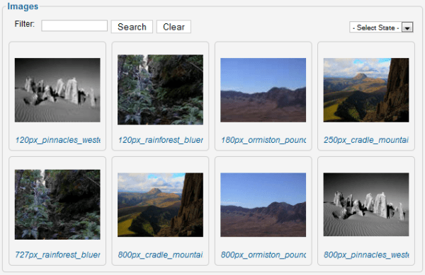
The standard Joomla filter fields above the images simplify the display of images according to your needs.
Depending on the number of images or your personal preferences, you may want to alter the size of the thumbnails to get a close-up or quick-browsing experience, use the following tool bar icons on the top right to switch thumbnail sizes:
 | Small thumbnails. |
 | Medium thumbnails. |
 | Large thumbnails. |
 icon in the tool bar at the top right to set specific sizes for each thumbnail mode.
Thumbnails are shown according to the current ordering set for the folder images, to change the ordering just drag and drop the thumbnails in the desired order. Clicking on an image will open a pop-up window where you can edit its details or perform several actions (see below).
Detail View
The detail view resembles a classic Joomla list with images properties shown one by line: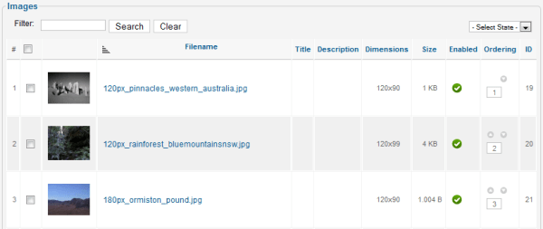
 | Enable the image(s) for display on the frontend. |
 | Disable the image(s) from being shown in the frontend. |
 | Remove the image(s). |
Image Details
Clicking on an image in the browsing view opens up an Image Details pop-up window where you can edit image properties and/or perform several actions: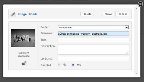
| Folder | This is the current folder of the image. You can select a new folder from the drop-down to relocate the image to another folder. |
| Filename | The name of the image file, you can edit the value to change the filename. This is a required field. |
| Title | An optional title assigned to the image. This value can be used by display modules on the frontend of the website. |
| Description | An optional description assigned to the image. This value can be used by display modules on the frontend of the website. |
| Link | An optional link URL assigned to the image. This value can be used by display modules on the frontend of the website. |
| Enabled | Enable or disable an image. This settings does not removes a file from your website, it just marks an image as Disabled and will not be included in frontend displays. |
Adding more images
Adding more images to your images/ folder can be done in multiple ways: You can use the default Joomla Media Manager, transfer them using an FTP client or using Easy Image Gallery's own upload option: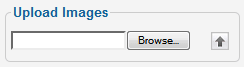 Just click on the Browse button to select an image file then click on the
  icon to start the upload. For multiple images, you can put them together in a .ZIP file and upload that file. Easy Gallery will unpack and store the images included.
There is no need to manually update Easy Image Gallery, it will automatically detect any missing or added images by itself.
Showing images on your website
The Easy Image Gallery component can support multiple frontend displays including image slideshows, banner displays and more. It does this by providing a common source of data based on the files and information you entered in the backend administrator pages to be used on separate applications.By default, Easy Image Gallery provides an implementation of li-slider slideshow JavaScript program featuring over a hundred transitions and many other features (you can read more about li-slider here.) and it is available as a Component View, a Module and a plugin. Each method can be copied and examined to develop your own extensions in an easy way (PHP knowledge is required).
Each Easy Gallery extension provided uses the same group of configuration settings but they have their own set of values. Read about how to enable each extension next and then read about how to configure each option below.
As with any other HTML/CSS content in the dynamic environment of a Joomla site, you must consider the results may vary depending on where on the page you place the slideshow. We have included strong predefined style values but you may want to change them according the specific needs of your site.
Using the Component View
 The component view can be accessed by creating a menu option on your website.
Use the standard Joomla Menu Manager to edit and add a menu option then click on the "Select" button in the Menu Item Type field and click on "Image Gallery" option from the "JoomlaXTC Easy Image Gallery" section shown in the pop-up window.
Set all menu options as desired (read below on how to configure the different Gallery options). Once the menu option is saved you can navigate your website and click on it to see the slideshow.
Using the Module
 The module extension must be installed first, then it can be configured like any other module in Joomla's Module Manager.
Depending on the settings, you can enable multiple modules at once but keep in mind CSS might conflict between module instances if different skins are used.
Using the Plugin
 The content plugin can be embedded in any Joomla Article or other items supporting Joomla content plugins as a custom tag with some special parameters. Being a plugin, all other parameters are set using Joomla's Plugin Manager and are shared among other plugin instances.
The format for the plugin is as follows:
These are the parameters to specify in the tag:
| folder_path | The full source folder path within the images folder. For example, to display all images from "images/sampledata/parks/" folder you must specify the value as "sampledata/parks". Disabled images will not be included for display. |
| width | The width in pixels for slideshow images. Keep in mind the actual size of the display can be different depending on the skin used. |
| height | The height in pixels for slideshow images. Again, keep in mind the actual size of the display can be different depending on the skin used. |
Once enabled in the Plugin Manager, the plugin will translate the embedded tag into a slideshow of the images from the selected folder path.
Content plugins need careful planning depending on how you set Joomla to display your contents, for example a plugin slideshow gallery might look just great when reading the article in full page but might not look that great if the article is shown in a blog view along with other articles.
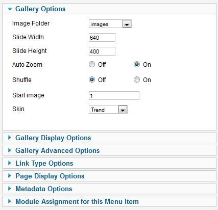
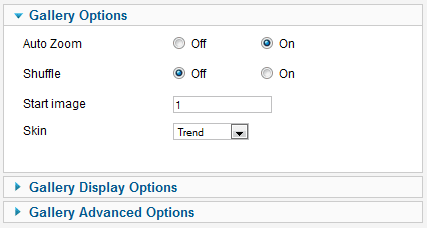
Gallery Options
As mentioned before, all extensions share certain groups of settings (since they all use the same slideshow system), this is a complete list of the different configuration parameters available: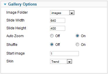
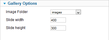
| Auto Zoom | Some images might have a different aspect ratio than others, which could cause the slideshow to look uneven. This parameter defines the way an image will be rescaled within the dimensions specified.
When disabled, the complete image will be rescaled to fit the dimensions area, leaving empty spaces on the sides if needed. When enabled, the image will be zoomed automatically to fit the dimensions without leaving any blank space to the sides. In both cases, the images will keep their original aspect ratios without distortion. |
| Shuffle | This parameter overrides the sorting order of the folder images to present them in random fashion. |
| Start Image | Regardless of the image sort order, the slideshow will start at this image. Set a value of 1 to make the slideshow start at the first image. |
| Skin | The image slideshow can be styled using one of the predefined CSS styles or "skins" available. Select a skin from the drop-down to apply. You can add additional skins in the component skins/ folder. |
Gallery Display Options
The slideshow can be configured in many ways using the following parameters, they are arranged in sections for an easy understanding as follows: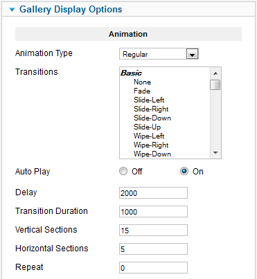
| Animation Type | Regular This will perform slideshow transitions using all effects in sequence, one at a time.
Random This will perform slideshow transitions effects in random order. Regular-Custom Transition effects are done in sequence according to the value selection of the next field. Random-Custom Transition effects are done in random sequence according to the value selection of the next field. Regular-Exception Transition effects are done in sequence using all but the effects selected in the next field. Random-Exception Transition effects are done in random sequence using all but the effects selected in the next field. |
| Transitions | Use in conjunction with the previous parameter to specify which transitions to use. You can learn more about how each transition effect works by visiting this page. |
| Auto Play | Enable or disable automatic slideshow changes. |
| Delay | How long each image slide will be shown (in milliseconds). |
| Transition Duration | The duration of the transition effect (in milliseconds). |
| Vertical Sections | How many columns a transition has (if blinds/squares transition is used). |
| Horizontal Sections | How many rows has a transition (if blinds/squares transition is used). |
| Repeat | With this option you can tell the slider how many times to repeat the slides. Use a value of 0 for infinite repeats. |
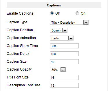
| Enable Captions | Enable or disable image title and description captions to be shown for each image. |
| Caption Type | Choose the content text for caption area. |
| Caption Position | Position of caption within the slide. |
| Caption Animation | The animation direction of the caption when they appear. |
| Caption Show Time | Time before the captions are shown (in milliseconds). |
| Caption Delay | How much time before the next slide the caption to disappear (in milliseconds). |
| Caption Size | Caption size (in pixels). Depending on orientation, this will set the height/width of the caption area. Combine this value with the Font Size parameters below to fine-tune the display according to your needs. |
| Caption Opacity | Caption background opacity. A decimal number between 0 (transparent) and 1 (opaque). |
| Title Font Size | Enter the font size for the caption's title (in pixels). |
| Description Font Size | Enter the font size for the caption's description text (in pixels). |
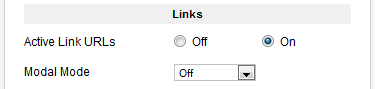
| Active Link URLs | To activate or disable link URLs. When enabled, clicking on a slide image that has a Link assigned will open a new browser window for that URL. This parameter must be enabled to activate the Modal modes below. |
| Modal Mode | When a link is included and the link points to YouTube, Vimeo, an image or QuickTime move, the slider will recognize what is the link type and will display the link in modal window. If you need video support you need to activate PrettyPhoto (also supports images). |
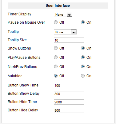
| Timer Display | Select where to show the timer bar for next image display. |
| Pause on Mouse Over | If the slider is in play mode and you move the mouse over the slider, this option pauses it. |
| Tooltip | When you hover the small slide buttons, a tooltip will popup. Choose the type of tooltip contents here. |
| Tooltip Size | Defines the tooltip width size in percents of the slider from 0 to 100. If you use text tooltip and have more text than the width, the tooltip will expand upwards (this is changeable through the skins CSS). |
| Show Buttons | Show or hide all buttons. |
| Play/Pause Buttons | Show or hide Play/Pause buttons. |
| Next/Prev Buttons | Show or hide Next/Prev buttons. |
| Autohide | Automatically hides the buttons after a certain amount of time if the mouse is not over the slider. |
| Button Show Time | How long to wait before showing the buttons if they are hidden (in milliseconds). |
| Button Show Delay | How fast the buttons appear if they are hidden (in milliseconds). |
| Button Hide Time | How long to wait before hiding the buttons if the mouse is not over the slider (in milliseconds). |
| Button Hide Delay | How fast to hide the buttons if the mouse is not over the slider (in milliseconds). |
Gallery Advanced Options
In addition to the slideshow configuration parameters, the following settings enhance the functionality of the Gallery: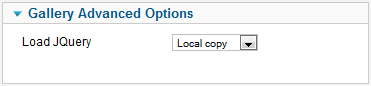
| Load jQuery | Select what copy of jQuery library to load. This setting is important if there are already another extension loading the javaScript jQuery library. Easy Image Gallery is programmed according to the recommended jQuery standards to function along other jQuery programs, however not all developers follow the rules and could cause javaScript conflicts if their program is not friendly to others. In an environment such as Joomla where multiple extensions can coexist, this is one of the main causes of javaScript failures. |
Customizing the Gallery
Adding new display types is easy. Just upload your images into a folder and let Easy Image Gallery do the management for you!There are two main ways to customize the gallery output, keep in mind a certain level of HTML, CSS, PHP and JavaScript knowledge may be required to develop some of the more advanced customizations.
Adding new Skins
The easiest way to add a new skin is to copy one of the built-in skin CSS files and adapt it to your desired style. Just locate the corresponding folder in the components/com_jxtceasyimage/skins/ folder and make a copy with a different name. The new skin folder will be included automatically in the Skin parameter options for you to choose.Skins are CSS-based, so just edit the skin.css file as you wish and put any custom images in the skin's images/ folder.
Adding new display modes
Adding new display modes may require editing HTML, PHP, CSS and/or javaScript code. You can code additional Joomla extensions to use Easy Image Gallery information, just include a few lines of code in your program:
require_once JPATH_ROOT.DS.'administrator/components/com_jxtceasyimage/support/helper.php';
$images = ezimgHelper::getImages('samples/demoimages');
The first line will enable Easy Image Gallery functions in your extension, and the second line is an example of how you can obtain the list of images from a folder.
You most probably have a loop where you want to include the URL of each image, so in order to obtain the corresponding image URL take a look at the following sample code:
foreach ($images as $image) {
  $url = ezimgHelper::getCacheFile($image,$width,$height,$zoom)
}
The second line above will return the complete URL of a rescaled image. Just feed an image object (as returned from the getImages() call), the desired width and height, and whether to Zoom or not the thumbnail as 0 (no) or 1 (yes) values.
The module extension contains commented code with more detail about image object properties. An easy way to add additional module displays is to just copy the "default.php" file with a different name and select it in the module's Alternative Layout parameter.
Additional Views & Modules
Besides the basic view, Easy Image is constantly updated with new slideshows. Here is a reference for other available modes:Slideshow
| Image Folder | Choose an image folder from your server. |
| Width | The width of the slideshow. |
| Height | The height of the slideshow. |
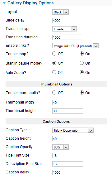
| Layout | Select a layout to use. Add custom layouts to the tmpl folder of the view/module. |
| Slide Delay | The delay between image transitions. |
| Transition Type | Select a transition effect to use. |
| Transition duration | The duration of the transition effect. |
| Enable links? | Enable or disable image links (if available). |
| Enable loop? | Makes the slideshow work in a continuous loop mode. |
| Start in pause mode? | Makes the slideshow start in pause mode. |
| Auto Zoom | Automatically zooms images to fit the slideshow area when needed. |
| Enable Thumbnails | Enable or disable thumbnail navigation |
| Thumbnail width | Thumbnail width (in pixels). |
| Thumbnail height | Thumbnail height (in pixels). |
| Caption type | Choose the contents for the caption area. |
| Caption height | Set the height of the caption area (in pixels). |
| Caption opacity | Set the caption area transparency. |
| Title font size | The height for title text font (in pixels). |
| Description font size | The height for description text font (in pixels). |
| Caption Delay | Delay to show the caption after the image is shown (in milliseconds). |
UnoSlider
Based on a popular slideshow engine, this mode offers a great variety of transition effects with support for captions and animated layers in a responsive markup ideal for mobile devices.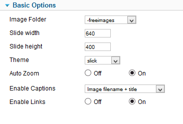
| Image Folder | Choose an image folder from your server. |
| Width | The width of the slideshow. |
| Height | The height of the slideshow. |
| Theme | Select a view style for the slideshow. Place additional themes in the themes folder of the component view directory. |
| Auto Zoom | Automatically zooms images to fit the slideshow area when needed. |
| Enable Captions | Disable or enable captions and their contents. |
| Enable links | Enable or disable image links (if available). |
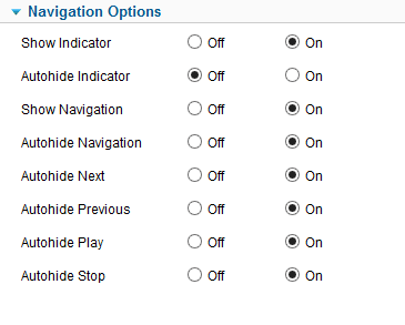
| Show Indicator | Enables or disables the position indicator. |
| Autohide Indicator | Makes the indicator dissapear after a while. |
| Show Navigation | Enables or disables the navigation buttons display. |
| Autohide Navigation | Makes the navigation buttons dissapear after a while. |
| Autohide Next | Includes the Next button on navigation autohide. |
| Autohide Previous | Includes the Previous button on navigation autohide. |
| Autohide Play | Includes the Play button on navigation autohide. |
| Autohide Stop | Includes the Stop button on navigation autohide. |
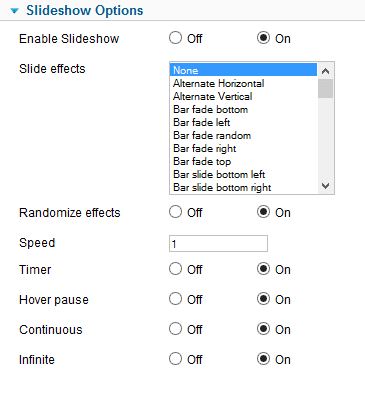
| Enable Slideshow | Enables animated slideshow mode |
| Slide effects | Select one or more effects to use for image transitions. |
| Randomize effects | Apply the selected effects in a random order, or sequentially |
| Speed | Duration of the transition effect. |
| Timer | Enables or disables a graphic timer for the next image. |
| Hover pause | Stops the slideshow on mouse hover. |
| Continuous | Enable or disable slideshow after a manual change. |
| Infinite | Makes the slideshow work in a continuous loop mode. |
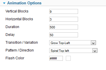
| Vertical Blocks | Set the number of vertical blocks. |
| Horizontal Blocks | Set the number of horizontal blocks. |
| Duration | Duration of the animation (in milliseconds). |
| Delay | Delay from block to block (in milliseconds). |
| Transition / Variation | Type of block animation / variation. This sets the animation style for each block on the image. |
| Pattern / Direction | Transition pattern / direction. This sets the block order for animation. |
| Flash Color | Set the color to use for flash effect. |
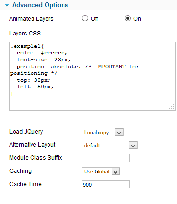
| Animated Layers | If enabled, image description contents will be shown as animated layers (see below). |
| Layers CSS | Custom CSS required for animated layers (see below). |
| Load jQuery | Select the method to load jQuery library. |
| Alternative Layout | Select any alternative layouts you may have. |
| Module Class Suffix | A CSS class to be assigned to the module (see Joomla documentation). |
| Caching | Select caching method (see Joomla documentation). |
| Cache Time | Cache life time ((see Joomla documentation). |
Animated Layers
As explained above, UnoSlider can display animated layers. This requires certain markup code to be present on image descriptions (you can edit them with Easy Image component) where you define the animation method for each one. In addition to that, your content overlays will require CSS code for visual styling and positioning.To setup an animated ayer, you must set the image description with certain HTML markup, for example:
<div class='unoslider_layers'>
	<div class='slide_right example1'>This will slide in from left to right</div>
	<div class='slide_left example2'>This will slide in from right to left</div>
	<div class='slide_top example3'>This will slide in from bottom to top</div>
	<div class='slide_bottom example4'>This will slide in from top to bottom</div>
	<div class='fade example5'>This will just fade in</div>
	<!-- you can use whatever you want, not just a text -->
	<div class='fade image'><img src='image.jpg' /></div>
</div>
Notice the different classes applied to each block: slide_right, slide_left, slide_bottom, slide_left and fade. These classes define the animation method for the block.
To define the position for each block within the slideshow area, you must specify this by using additional CSS markup such as this:
			.example1 {
			  color: #cccccc; /* font color */
			  font-size: 23px; /* font size */
			  position: absolute; /* IMPORTANT for positioning */
			  top: 30px; /* 30px from top side */
			  left: 50px; /* 50px from left side */
			}
Set the corresponding CSS statements according to your needsand include this markup in the Layers CSS parameter or add to your existing template CSS file.
Please notice this feature is unique to UnoSlider mode and will not work or even break on other slideshow modes.
Copyright 2012 Monev Software LLC www.joomlaxtc.com