Description
The YouTube Playlist Wall provides an easy and powerful solution to display videos from YouTube playlists on your website. You can customize the video player with different options as well as choose a layout and styling for the module display, or create your own one.
Like the other extensions in our content Wall family, the module allows you can use any custom HTML and CSS needed to match your website design or create your own custom displays with over 20 place-holder tags for titles, descriptions, prev/next buttons and different image sizes to position video data exactly where you need. The wall comes ready with 8 responsive layouts compatible with both desktop and mobile devices.
Introduction Video
Administration Video
Installation
Upload the module .zip file to your site using Joomla's Extension manager in the administrator area.
Configuration
Once installed, go to Joomla's Module Manager and open the module parameters page. Adjust the operation parameters as desired, then set the module template position, menu options and enable it. These are the parameters available:
API Key
A YouTube API key is required. This API key allows the module to interact with YouTube to fetch playlist and video information (it also works on videos from other channels playlists).
If you don't have an API key yet please check Google's own tutorial on how to get one. It contains the latest procedure changes and may also be available in your own language.
Briefly, you have to:
- Get a Google/YouTube account.
- Register a YouTube App.
- Enable and get your key from the API console.
Playlist ID
This identifier defines which YouTube playlist to get videos from.
You can enter a playlist ID directly or use the Channel query tool to select one after entering your API key. Click on the icon to the right to open the query tool, enter a YouTube channel name and click on the Query button to see a list of available playlists to choose from. Click on the icon again to close the query tool.
Playlist IDs can also be obtained manually from their URL address, for example:
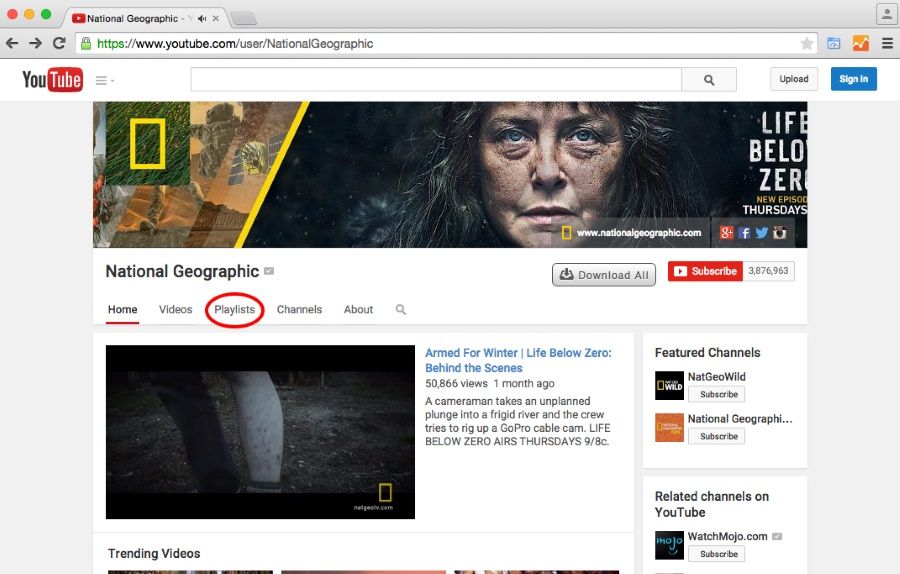
Go to any YouTube channel and click on the Playlists link:

On the Playlists view, click on the playlist you want:

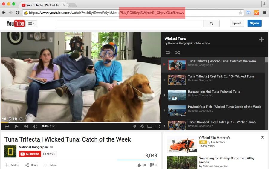
When the playlist is shown, look at the page URL and note the "list" variable. This is the value you need to set on this module parameter:

Columns
Besides the main player, the module can show all videos in a grid. Use this value to set how many columns you want to have.
Rows
The number of video rows to show.
Template
Select a built-in layout to display the video player and playlist grid. You can also use the next module parameters to build your own layouts and styles right from the module editor (click on the Edit button to copy the markup for easier editing).
Set this parameter to "none" to use the following parameters instead.
Read the 'Adding more layouts' section to learn how to add more options to this field.
Module HTML template
This parameter contains the overall HTML markup to render the module contents. There are several placeholder tags you can use to position content:
| Tag | Description |
|---|---|
| {player} | This represents the video player. The tag will be replace with YouTube's player when the module contents are shown. |
| {title} | If present, this tag will be replaced with the title of the video currently being played. |
| {grid} | This represents the video playlist grid (see below). An array of columns and rows will be shown with the information of each video. The videos will be shown on the main player when the user clicks on them. |
| {prev_button} | This will draw a button to get the previous page of the playlist. |
| {next_button} | This will draw a button to get the next page of the display. |
| {playlist_url} | The URL to the Playlist page on YouTube |
Item HTML template
The parameter contains the HTML markup used to render each video item on the playlist grid. As in the previous parameter, place-holder tags allow you to position video data anywhere in the code:
| Tag | Description |
|---|---|
| {title} | The video title |
| {description} | The video description |
| {default_image} | An IMG tag with the default image (if available) of the video |
| {default_image_url} | The default image URL (if available). |
| {default_image_width} | The default image width in pixels |
| {default_image_height} | The default image height in pixels |
| {medium_image} | An IMG tag with the medium image (if available) of the video |
| {medium_image_url} | The medium image URL (if available). |
| {medium_image_width} | The medium image width in pixels |
| {medium_image_height} | The medium image height in pixels |
| {high_image} | An IMG tag with the high image (if available) of the video |
| {high_image_url} | The high image URL (if available). |
| {high_image_width} | The high image width in pixels |
| {high_image_height} | The high image height in pixels |
| {standard_image} | An IMG tag with the standard image (if available) of the video |
| {standard_image_url} | The standard image URL (if available). |
| {standard_image_width} | The standard image width in pixels |
| {standard_image_height} | The standard image height in pixels |
Player Width
Use this parameter to define the main player width (in pixels). Note: the player size can be overridden with CSS code, which is especially useful to make it responsive and mobile friendly.
Player Height
The player height (in pixels).
Auto play video?
Choose to start automatic playback of the first video.
Auto hide controls?
This will hide player video controls automatically when playback starts
Show controls
Display or hide video player controls.
Disable keyboard?
Enable or disable keyboard player control.
Allow full screen?>
Enable or disable full screen mode (selectable by the user).
Show annotations?
Enable or disable annotations included on videos.
Show related videos?
Set the video player to show links to related videos after playback is done.
Show info?
Enable or disable the video information area. This includes the video title, author and social network sharing controls.
Theme
Choose the skin for the video player. Available options are 'Dark' and 'Light'.
Progress bar color
Select the progress bar color. Available options are 'Red' and 'White'.
Advanced Parameters
The advanced parameter section contains two parameters specific to this module plus some others included automatically by Joomla meant to control the module rendering.
These are the two specific module parameters:
Custom CSS
Like the template parameters, this parameter allows you to enter CSS code however, the code in here is always used regardless of the other parameters. This means you can use it to style your own custom HTML markup, the module itself or even fix and override the main template style.
Keep in mind Cascade Style Sheets (CSS) are sensitive to the cascade order and the order position of this code in the overall cascade of the website will depend on the module call order done by Joomla. Make sure to test your code.
jQuery load
Use this parameter to manage jQuery inclusion. Set it to "none" if jQuery is already being called somewhere else. When set to 'Latest from Google', jQuery will be called from Google servers. Set the value to 'Local copy' to use Joomla's own copy. This is the preferred value.
Scroll-to element
Users might need to scroll away from the player when your playlist grid is large, this option allows you to enable a scroll-to effect back to the player when they click on any grid thumbnail for a better experience. Not only that: you can also set it to scroll to any other HTML tag by entering the tag identifier in this field. This is useful to scroll back to navigation menus or other elements. if you wish to disable the effect, simply leave the field empty.
Scroll-to speed
Set the time (in milliseconds) for scroll-to animation to take effect.
Adding more layouts
Built-in layouts are stored on the module's "templates" folder on their own subdirectory. To create one you can simply copy an existing one and edit the files within:
| File | Description |
|---|---|
| module.html | This file contains the overall markup for the module |
| element.html | This file contains the markup for each item element on the playlist grid. It will be rendered multiple times, once for each video. |
| template.css | A CSS file to be included when this layout is selected. Use it to apply styling to the HTML markup in the previous files. |
| index.html | An empty file placed for security reasons. Joomla recommends having one on every directory (except root directory, of course). |
Styling the module
The module includes several CSS selectors to make the styling of advanced designs easier for you. Here are the selectors you can use in addition to your own:
| Selector | Description |
|---|---|
| #jxtcytpwtitle | Current video title text. |
| #jxtcytpwgrid | Grid container wrapper. |
| #jxtcytpwprev | Previous page button. |
| #jxtcytpwnext | Next page button. |
| .ytpw_prev | Used on the DIV tag button for previous page function. |
| .ytpw_next | Used on the DIV tag button for next page function. |
| .ytpw_loading | Applied to the grid container during a page load |
| .ytpw_disabled | Applied to "previous page" or "next page" DIV tags if the function is not available. |
| .ytpw_row | Used on each row's DIV tag |
| .ytpw_rowX | Used on each row's DIV tag. X is a number starting from zero (e.g. ytpw_row0, ytpw_row1, ytpw_row2, etc.) |
| .ytpw_video | Used on each video item container DIV tag |
| .singlecol | Used on the video item container DIV tag when only one item is present on the row |
| .firstcol | Used on the left-most item container DIV tag in the row |
| .centercol | Used on the inner item container DIV tags in the row |
| .lastcol | Used on the right-most item container DIV tag in the row |
| .oddcol | Used on item container DIV tags in odd columns |
| .evencol | Used on item container DIV tags in even columns |

