Description
Bored of the classic Joomla! login form? It's time to change that, with the Slide Pane module you can create a custom cool login form that will impress to your users, you will be able to create an "eye candy" effect to get a panel that can show the login form of the site but not only that, you can set your custom styles to show more information, images or some other additional content that you imagine, sky is the limit!
Installation
Install the module using the regular Joomla! extension installer.
Configuration
The module can be customized using the standard Joomla! Module Manager.
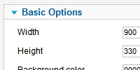
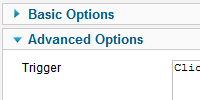
Parameters are divided in two main sections: The Basic Options section defines what effect will be shown and how it should be presented. The Advanced Options allows you to configure the layout that each part of the module will use.
To access these parameters go to the module manager and select the Slide Panel Module.
Basic Options
 Use these parameters to customize the standard presentation of the module
| Width | Number - Use this parameter to set the width (in pixels) of the panel. |
| Height | Number - Use this parameter to set the height (in pixels) of the panel. |
| Background color | Number - On this parameter you can set a colour value (in hexadecimal code [without 0x]) that will be used as background colour of the panel. |
| Background opacity | Number - Set the opacity of the background colour, the value can be 0 to 100, 0 is completely opaque and 100 completely transparent. |
| Direction | Selector - Set the direction that you want that the slide takes to appear. |
| Slide In duration | Number - Use this parameter to set the duration (in milliseconds) of the slide effect of the panel when is show. |
| Transition In type | Selector - Set the type os transition effect that the panel use when is show. |
| Transition In Ease mode | Selector - Set the Ease effect that the panel use when be show. |
| Close text | Text - Set the text that you want show on the "Close" button. |
| Panel Closing FX | Selector - Use this parameter to set the effect that the panel show when is closed. |
| Slide Out duration | Number - Set the duration (in milliseconds) of the effect that is show when the panel is closed. |
| Transition Out type | Selector - Set the type of transition that the module will use when is closed. |
| Transition Out Ease mode | Selector - Set the Ease effect that the panel use when is closed. |
| Boxes Layout | Selector - Select the layout that the panel contains (left box, right box or both). |
| Boxes Animation Order | Selector - Set the order of the animation that the layout will take when the panel is show. |
| Box Width | Number - Set the width (on pixels) that the left box will take. |
| Box Height | Number - Set the height (on pixels) that the left box will take. |
| BoxLeft FX | Selector - Select the effect that want show when the left box is show. |
| Slide Direction | Selector - Set the direction of the slide effect of the left box. |
| Transition duration | Number - Set the time (in milliseconds) that the left box will take to appear. |
| Transition type | Selector - Use this parameter to select the type of transition that the left box will take. |
| Transition Ease mode | Selector - Set the Ease type that the left box will take. |
| Right Box Width | Number - Set the width (on pixels) that the right box will take. |
| Right Box Height | Number - Set the height (on pixels) that the right box will take. |
| BoxRight FX | Selector - Select the effect that want show when the right box is show. |
| Right Box Slide Direction | Selector - Set the direction of the slide effect of the right box. |
| Transition duration | Number - Set the time (in milliseconds) that the right box will take to appear. |
| Transition type | Selector - Use this parameter to select the type of transition that the right box will take. |
| Transition Ease mode | Selector - Set the Ease type that the left box will take. |
| Template | Selector - Select if you want use one of the predefined templates that the module includes (you can also set your custom layout using the advanced parameters) |
| Content plugins | Selector - Enable this parameter if you want allow that the module execute the content plugins that are embedded on his layout (like the loadposition plugin) |
Advanced Parameters
 Use this parameters if you want generate a custom design of the Slide Panel module.
| Trigger | Text - Use this parameter to define the custom HTML/CSS code that will be show as "Trigger". |
| Trigger Out | Text - Use this parameter to define the custom HTML/CSS code that will be show as "Trigger Out". |
| Left Box | Text - On this parameter you can set the custom HTML/CSS or plugin tags that the panel will show as Left Box, on this parameter also can use the {loginform} tat, this tag will return (if exist) the default login module that is set on the position loginform. |
| Right Box | Text - On this parameter you can set the custom HTML/CSS or plugin tags that the panel will show as Right Box, on this parameter also can use the {loginform} tat, this tag will return (if exist) the default login module that is set on the position loginform. |

