Description
The JoomlaXTC Category Wall module enables you to display selected information from Joomla categories using built-in layouts or build your own with custom CSS and HTML. The module can display articles in rows, columns and grids as well as special scrolling effects for sliders and transitions.
Installation
Install the module using the regular Joomla! extension installer.
Configuration
The module can be configured using the standard Joomla! Module Manager.
Parameters are divided in three main sections: The Selection Parameters define what data will be shown, the Display and More Area parameters define how the data will be shown, and the Advanced Parameters tab allows you to configure the special effects and animations, if used. Advanced parameters won't affect the data, but they can affect their display form.
To access these parameters go to the module manager and select the JoomlaXTC Category Wall Module.
Selection Parameters
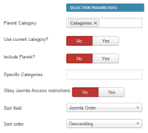
Use these parameters to set your search criteria for component data.

| Parent Category | Use this parameter to select the parent category to use, all categories inside will be shown as items on the wall. |
| Use current category? | If enabled, the category currently browsed will be used instead. |
| Include Parent? | When enabled, the parent category will also be included in the display. |
| Specific Categories | Enter specific category Ids to display. This will override any other selection or filter. |
| Obey Joomla Access restrictions? | Choose to obey or discard Joomla access restrictions for the categories to be shown. |
| Sort field | Set the desired sort method to display categories. |
| Sort order | Set the sort ordering. |
Display Parameters
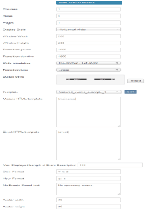
Use these parameters to customize the layout of the module box. The layout consists of a grid made up with one or more pages of events organized in rows and/or columns.

| Columns | Number of columns to show. | ||||||||||||||||||||||||||||||||||||||||||||||||||||||||||||||||
| Rows | Number of rows to show. | ||||||||||||||||||||||||||||||||||||||||||||||||||||||||||||||||
| Pages | Number of pages to show. Transition effects are enabled between page changes. | ||||||||||||||||||||||||||||||||||||||||||||||||||||||||||||||||
| Offset | Number of results to skip. This is handy when you want to show the first group of results on one module and the next group in a different module. | ||||||||||||||||||||||||||||||||||||||||||||||||||||||||||||||||
| Display Style | Special effects applied to the layout. Window modes work with one page only, all others require multiple pages of content to perform transitions between them. | ||||||||||||||||||||||||||||||||||||||||||||||||||||||||||||||||
| Window Width | Width (in pixels) of the window frame when using a Window special effect. | ||||||||||||||||||||||||||||||||||||||||||||||||||||||||||||||||
| Window Height | Height (in pixels) of the window frame when using a Window special effect. | ||||||||||||||||||||||||||||||||||||||||||||||||||||||||||||||||
| Transition pause | Pause time between page transitions in milliseconds. A value of -1 disables automatic transitions. Default value is: 4000. | ||||||||||||||||||||||||||||||||||||||||||||||||||||||||||||||||
| Transition duration | Page transition effect duration in milliseconds (default: 1500). | ||||||||||||||||||||||||||||||||||||||||||||||||||||||||||||||||
| Slide orientation | Slide transition orientation. | ||||||||||||||||||||||||||||||||||||||||||||||||||||||||||||||||
| Transition type | Transition animation type. | ||||||||||||||||||||||||||||||||||||||||||||||||||||||||||||||||
| Button Style | Button graphic set to use when buttons tags are enabled. | ||||||||||||||||||||||||||||||||||||||||||||||||||||||||||||||||
| Template | To select one of our predesigned template. NOTE: Select None to use Module HTML template and Main Content HTML template parameter values below. | ||||||||||||||||||||||||||||||||||||||||||||||||||||||||||||||||
| Module HTML template | HTML/CSS code to display the overall module box. You can embed any of the following tags:
|
||||||||||||||||||||||||||||||||||||||||||||||||||||||||||||||||
| Event HTML template | HTML/CSS code to display each item. You can embed any of the following tags to display article information:
|
||||||||||||||||||||||||||||||||||||||||||||||||||||||||||||||||
| Max Displayed Length of Event Description | Enter a number. Event descriptions longer than that number will be shortened and a '...' appended. | ||||||||||||||||||||||||||||||||||||||||||||||||||||||||||||||||
| Date format | Default date format (using PHP date function). Default is: Y-m-d | ||||||||||||||||||||||||||||||||||||||||||||||||||||||||||||||||
| No upcoming events. | If No Events Found the module will display this text | ||||||||||||||||||||||||||||||||||||||||||||||||||||||||||||||||
| Avatar width | Use to set the width of the avatar. Note: The avatar tags only work if the compatibility is active. | ||||||||||||||||||||||||||||||||||||||||||||||||||||||||||||||||
| Avatar height | Use to set the height of the avatar. Note: The avatar tags only work if the compatibility is active. |
'More' Area Parameters
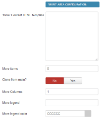
Use these parameters to set items in the 'More' area when it is used.

| 'More' Content HTML template | Custom HTML/CSS template for the more area. It uses the same tags as the Event HTML template |
| More items | Amount of events to show in More Area |
| Clone from main? | Choose to use the same items as the main Event template, or use additional events |
| More columns | Number of display columns |
| More legend | An optional title label for the More Area |
| More legend color | Set the color of the More Area title |
| Z layer | Define the z-index layer to use for the special effect content. |
Tooltip / Pop-Up FX Settings - Use these parameters to customize the Tooltip and Pop-Up effects: | |
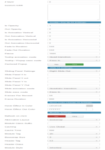
| In Opacity | The opacity of the tooltip/pop-up when the mouse enters the trigger zone. A value of 0 will make the display transparent while a value of 1 will make it opaque, values range from 0 to 1 in decimal increments. |
| Out Opacity | The opacity of the tooltip/pop-up when the mouse leaves the trigger zone. A value of 0 will make the display transparent while a value of 1 will make it opaque, values range from 0 to 1 in decimal increments. |
| In Animation Vertical | The distance the tooltip/pop-up will move vertically (in pixels) when the mouse enters the trigger zone. |
| Out Animation Vertical | The distance the tooltip/pop-up will move vertically (in pixels) when the mouse leaves the trigger zone. |
| In Animation Horizontal | The distance the tooltip/pop-up will move horizontally (in pixels) when the mouse enters the trigger zone. |
| Out Animation Horizontal | The distance the tooltip/pop-up will move horizontally (in pixels) when the mouse leaves the trigger zone. |
| Fade-in Duration | The duration of the "In" animation when the mouse pointer enters the trigger zone (in milliseconds). |
| Fade-Out duration | The duration of the "Out" animation when mouse pointer leaves the trigger zone (in milliseconds). |
| Pause | The time the tooltip/pop-up will be shown between the "In" animation and the "Out" animation (in milliseconds). |
| Tooltip animation mode | Select one of the many Moo functions to perform animations. |
| Tooltip / Popup ease mode | The transition type. All transitions, except for "linear" transition, can be combined with a "Transition Ease". |
| Centered Popup | Set this to "Yes" if you want pop-up effect displays to appear centered in the browser window. |
Slide FX Settings - These parameters control the "Slide" content effect: | |
| Sliding Panels Settings | Choose an animation style from the list. |
| Note: The following Settings are used ONLY when Slide Panels Settings is set to CUSTOM: | |
| Slide Panel X in | The distance (in pixels) from the left trigger zone border that the slide panel will go to when the mouse enters the trigger zone. |
| Slide Panel X out | The distance (in pixels) from the left trigger zone border that the slide panel will go to when the mouse leaves the trigger zone. |
| Slide Panel Y in | The distance (in pixels) from the top trigger zone border that the slide panel will go to when the mouse enters the trigger zone. |
| Slide Panel Y out | The distance (in pixels) from the top trigger zone border that the slide panel will go to when the mouse leaves the trigger zone. |
| Slide animation mode | Select one of the many Moo functions to animate the slide effects. |
| Slide ease mode | Choose how to apply the animation effect. This setting is not used when "Slide Animation Mode" is set to Linear. |
| Frames per Second | The frames per second used to animate the effect. Note: Using a high value in a heavy site could decrease the video performance. Combine this setting with "Frame Duration" to get a smooth effect. |
| Fame Duration | The time (in milliseconds) the duration will last. |
Hover FX Settings - These Parameters Control the Hover Effect: | |
| Hover Effect in Color | The background color that will fade in when mouse enter the element with class="js_hover". |
| Hover Effect Out Color | The background color that will fade out when mouse leaves the element with class="js_hover". |
Special effects
Besides the page transition effects, you can also include additional effects that apply to the content of each item. By adding certain CSS tags to your HTML code and organizing the layout of content, these effects allow you to build fully customizable tooltips, pop-ups and slide effects. Since all the content data tags are available on these effects as well, you can elaborate the display of your content as much as you want!
Keep in mind however, that with great power comes great responsibility: the HTML of both zones is still part of the HTML code of your page; if your HTML/CSS code has a bug, it may affect how other parts of your site look and work.
Content effects are activated by the user's mouse pointer but with subtle differences. How you can implement each effect and how they are activated is explained below:
Tooltips
A Tooltip will appear automatically when the mouse pointer hovers over a specific "trigger zone", this example code explains better how to use the necessary tags:
Code Sample | Sample Effect |
|
This is the tooltip trigger zone
This is the tooltip content
|
Upon display, this code will show the "This is the tooltip trigger zone" legend by itself, but if you move the mouse pointer over it, a tooltip will come up displaying the "This is the tooltip content" legend. Each zone is wrapped within a tag, you must use the CSS tags "jxtctooltip" and "tip" as shown to make the effect work.
Pop-ups
A pop-up will appear when the user clicks on the "trigger zone", the Pop-up zone has its own Close and Drag buttons. This example code shows the necessary CSS tags in use:
Code Sample | Sample Effect |
|
This is the pop-up trigger zone
This is the pop-up content
|
The trigger zone is made with the contents of the div with class "popuphover", and the pop-up content is hidden in the div with class "pop", it will be shown when the user clicks on the trigger zone.
Slides
Slides are useful to display content in different layers, for example imagine a picture with a footnote that expands to show a full description. Different than Tooltips or Pop-ups, Slides do not use a trigger zone, they react to mouse pointer over their own zones. This is an example code:
Code Sample | Sample Effect |
|
Again, the container zone inside the div with CSS class "slidebox" will be shown first, and the contents of the slide on div "slidepanel" will be shown when the mouse hovers its zone.
Hover
The Hover is useful when you want to focus on specific zone of the content, for example a "clickable" zone that looks similar to other content, an image or name that want to highlight. Similar to Slides, they react to mouse pointer over their own zones and does not need a trigger zone. This is an example code:
Code Sample | Sample Effect |
|
This is the content zone
The content with highlight
This is the rest of content zone
|
Once the mouse is over the js_hover zone the color will change automatically. As you can see this is the easier effect but provide you the power to catch the attention of your visitors.
Styling
As previously explained, the content is rendered in a grid fashion with one or more rows and columns and one or more pages, each page represents a single grid. Each cell in a grid contains the template code for one item with the placeholder tags translated to their corresponding data element such as titles, descriptions, images, etc.
In order to ease the visual styling of the grids, there are certain common CSS classes added to the HTML code for your convenience. You can put hard-coded CSS styling in the XTS template fields directly, but you may find using your template's CSS file a better option.
If you can't or don't want to alter your main CSS file, you can put any CSS code needed in the module's own file: css/wall.css. This file is located inside the module folder.
This is a brief explanation on how the HTML and classes are applied:
Each page in the module output is made with an HTML < table /> tag; the first table has CSS class firstpage, any inner pages have class centerpage and the last page has class lastpage. If there is only one page then it has class singlepage.
Each row within a table also has similar classes added to it: firstrow for the top row in the table, centerrow for any middle rows and lastrow for the bottom row of content. In the event that only a single row is used, it will have class singlerow assigned to it. These clases are repeated for as many tables (pages) are in the module output.
Likewise, columns also have similar tags: the left-most column has firstcol, the right-most column has lastcol and any middle column has centercol. Single columns have, you guessed it, singlecol. These classes are also applied on all pages shown.
Buttons also have extra CSS classes: prevbutton and nextbutton apply to the < a /> tags for each page change button. Page number buttons have tags as well: firstbutton, middlebutton, lastbutton and centerbutton.
You can have a common set of CSS styling code for these tags in your template's CSS file to maintain a consistent appearance on any modules being shown, or you can use them in combination with the module CSS class parameter to define specific styling for a particular module.
With these many options, the styling possibilities are unlimited! You are in total control of how the content will be shown in your site, just let the module handle the content gathering for you.
Video Tutorial
Warning: Illegal string offset 'style' in /mnt/data/vhosts/casite-810015.cloudaccess.net/httpdocs/libraries/src/Helper/ModuleHelper.php on line 235
Warning: Illegal string offset 'style' in /mnt/data/vhosts/casite-810015.cloudaccess.net/httpdocs/libraries/src/Helper/ModuleHelper.php on line 252
Didn't find an Answer?
If you didn't find the answer you were looking for from the links above.
SUBMIT SUPPORT TICKET
Warning: Illegal string offset 'style' in /mnt/data/vhosts/casite-810015.cloudaccess.net/httpdocs/libraries/src/Helper/ModuleHelper.php on line 235
Warning: Illegal string offset 'style' in /mnt/data/vhosts/casite-810015.cloudaccess.net/httpdocs/libraries/src/Helper/ModuleHelper.php on line 252
Warning: Illegal string offset 'style' in /mnt/data/vhosts/casite-810015.cloudaccess.net/httpdocs/libraries/src/Helper/ModuleHelper.php on line 235
Warning: Illegal string offset 'style' in /mnt/data/vhosts/casite-810015.cloudaccess.net/httpdocs/libraries/src/Helper/ModuleHelper.php on line 252
Popular Questions
Didn't find an Answer?
If you didn't find the answer you were looking for from the links above.
SUBMIT SUPPORT TICKET
Warning: Illegal string offset 'style' in /mnt/data/vhosts/casite-810015.cloudaccess.net/httpdocs/libraries/src/Helper/ModuleHelper.php on line 235
Warning: Illegal string offset 'style' in /mnt/data/vhosts/casite-810015.cloudaccess.net/httpdocs/libraries/src/Helper/ModuleHelper.php on line 252
Warning: Illegal string offset 'style' in /mnt/data/vhosts/casite-810015.cloudaccess.net/httpdocs/libraries/src/Helper/ModuleHelper.php on line 235
Warning: Illegal string offset 'style' in /mnt/data/vhosts/casite-810015.cloudaccess.net/httpdocs/libraries/src/Helper/ModuleHelper.php on line 252
Warning: Illegal string offset 'style' in /mnt/data/vhosts/casite-810015.cloudaccess.net/httpdocs/libraries/src/Helper/ModuleHelper.php on line 235
Warning: Illegal string offset 'style' in /mnt/data/vhosts/casite-810015.cloudaccess.net/httpdocs/libraries/src/Helper/ModuleHelper.php on line 252
Warning: Illegal string offset 'style' in /mnt/data/vhosts/casite-810015.cloudaccess.net/httpdocs/libraries/src/Helper/ModuleHelper.php on line 235
Warning: Illegal string offset 'style' in /mnt/data/vhosts/casite-810015.cloudaccess.net/httpdocs/libraries/src/Helper/ModuleHelper.php on line 252
OUR PRODUCTS
SITE LINKS
JOIN OUR NEWSLETTER
Warning: Illegal string offset 'style' in /mnt/data/vhosts/casite-810015.cloudaccess.net/httpdocs/libraries/src/Helper/ModuleHelper.php on line 235
Warning: Illegal string offset 'style' in /mnt/data/vhosts/casite-810015.cloudaccess.net/httpdocs/libraries/src/Helper/ModuleHelper.php on line 252
Warning: Illegal string offset 'style' in /mnt/data/vhosts/casite-810015.cloudaccess.net/httpdocs/libraries/src/Helper/ModuleHelper.php on line 235
Warning: Illegal string offset 'style' in /mnt/data/vhosts/casite-810015.cloudaccess.net/httpdocs/libraries/src/Helper/ModuleHelper.php on line 252


