JoomlaXTC Grid Gallery
The Grid Gallery is an easy-to-use component to create image and video galleries of your portfolio or cool pictures in an attractive and engaging way. Some of its features are:
- Works with local or remote media
- Unlimited albums with independent configuration
- Unlimited media files per album
- Unlimited albums per gallery
- HTML support on description fields
- Power to show .mp4, .mov, .fla and another flash-supported codec videos
- Automatic thumbnail resizing
- YouTube video support
- Display gallery as a component or module
- Module supports embedded, pop-up, automatic pop-up and lightbox modes
- Gallery size customizable
- Can have multiple galleries on at the same time
- Flash-based gallery with three display modes: Grid, Mosaic and Carousel
- Auto-resizing grid
- Advanced video player
- Pan and Zoom
Installation
Follow these steps to install the Grid Gallery:
- Unzip the jxtc_gridgallery_j15_unzipfirst.zip package in your PC.
- Install the extracted files to your Joomla install via the Joomla Installer. The com_jxtc_gridgallery_j15.zip file contains the required frontend and backend components interfaces and mod_jxtc_gridgallery_j15.zip file contains the optional Grid Gallery display module.
Component Configuration
Access the component administration pages by selecting "JXTC Grid Gallery" from the Joomla! Components menu.
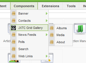
In order to show the Grid Gallery in your site you must first create an Album, an album could represent a collection of images, videos that you want to display to your visitors. You can have an unlimited amount of Albums defined. For your convenience, a folder named "GridGallery" has been created in your media/ folder at installation time. You can choose to store all your media files on it. Also, it will contain the thumbnails created automatically when adding albums and media items.
Creating and Configuring Albums
Select the Albums menu option; this will take you to a list of all albums defined in your system. To create a new album, click on the "New" icon in the top right.
The album edition page will display the area where you can define the attributes of the album:
Album Setup
The parameters in this section are:
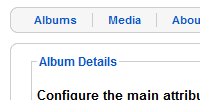
- Title
- A unique name for the album
- Thumbnail
- Select the image that will be show as thumbnail of your Album (an automatic thumbnail will be created from it)
- Area Width
- The width area (in pixels) of the thumbnail area including title and description, the recommended value is 140 pixels
- Area Height
- The height area (in pixels) of the thumbnail area including title and description, the recommended value is 140 pixels
- Order
- Set the position of the album in relation to other albums
- Published
- Use this parameter to set an album as active or inactivate
Creating and Configuring Media Items
Once an album is created, you can proceed to add media items to it.
Select the Media menu option; this will take you to a list of all Media items defined in your system. To create a new media item, click on the "New" icon in the top right.
The media edition page will display the area where you can define the attributes of the media item:
Media Setup
The parameters in this section are:
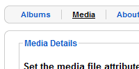
- Title
- Select thumbnail
- Select the image that will be show as thumbnail for your Media Item (an automatic thumbnail will be created from it).
- Select media
- For remote files, type the url to the video/image to use, for local media click on the Select button to use the included file browser to select or upload files to your server. Note: For YouTube videos, you must to type the url in this form: https://www.youtube.com/v/ID where ID is the value after the v= in the original URL, for example, to add this video: https://www.youtube.com/watch?v=Cywm889e0Vs you must type this url: https://www.youtube.com/v/Cywm889e0Vs
- Description
- Add the description of the video/image that you want to show. You can use any Flash-supported HTML tags.
- Album Name
- Select the album to contain this media item.
- Order
- Sett the position of the media item in the album.
- Published
- Use this parameter to set an item as active or inactivate.
Component on Front end
After albums and media items are added, you can enable your site's frontend for component display.
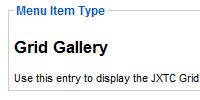
Creating a Grid Gallery menu option
To make a menu option link to Grid Gallery component, you should use the standard Joomla! Menu Manager to edit the desired menu, and then follow these steps:
- Click on the "New" icon in the top left to create a new menu entry.
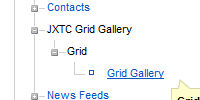
- On the menu entry settings page, edit the fields on the left "Menu Item Details" area according to your preference.
- On the right side, open the "Parameters (basic)" tab and select which Albums to display:
- Albums
- If ALL ALBUMS is chosen, all Albums will be shown from top to bottom according to their ordering. You can choose multiple albums by holding the CTRL key while clicking on them.
- Main Album
- Select the album that will be shown first in the gallery. This album must be included in the selected albums in the previous parameter.
- Grid Width
- Set the width of the gallery display (in pixels).
- Grid Height
- Set the height of the gallery (in pixels).
- Default mode
- This is the starting display mode for the gallery; you can later change modes while browsing the gallery itself.
- If needed, open the "Parameters (System)" tab and edit the fields as you wish.
- Click on the "Save" or "Apply" icons on the top left to store your changes.
You have now created a menu link that will display the Grid Gallery view.
Module Configuration
Sometimes we want to display the grid gallery in another page with more and/or bigger content or as a complement for content, in this case we can use the module version of the Grid Gallery.
The module can be positioned and customized using the standard Joomla! Module Manager.
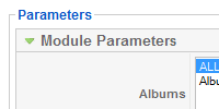 To access these parameters go to the module manager and select the Grid Gallery Module:
- Albums
- If ALL ALBUMS is chosen, all Albums will be shown from top to bottom according to their ordering. You can choose multiple albums by holding the CTRL key while clicking on them.
- Main Album
- Select the album that will be shown first in the gallery. This album must be included in the selected albums in the previous parameter.
- Grid Width
- Set the width of the gallery display (in pixels).
- Grid Height
- Set the height of the gallery (in pixels).
- Default mode
- This is the starting display mode for the gallery; you can later change modes while browsing the gallery itself.
- Display Type
- Use to select the display mode of the module, select between Lightbox, pop-up, automatic pop-up and standard module embedding.
- Link Button
- For pop-up and lightbox modes, you can choose to display an image as a button to open the windows. Store your images in the media/GridGallery/ folder and select one here.
You can now see the Grid Gallery in a module position.
Tips to use the Grid Gallery
There are some considerations while using the Grid Gallery, please take note of the following:
- The Grid Gallery works best when there is plenty of space in the frontend.
- Optimize the use of real-estate in the frontend by changing the Grid dimensions, the thumbnail area dimensions and the length of titles and descriptions.
- For restricted spaces, a pop-up window will allow you to have a larger area for the gallery.
- Remote files might be subject to Flash 10 security restrictions, read about Flash "crossdomain.xml" files to enable your site to read external files.
- Although some video files do have the "right" file extension, their actual binary format might not be accepted by Flash for playback.
Copyright 2010 Monev Software LLC www.joomlaxtc.com

